Every business that sells contracts has a version of this story. A support contract lapses. A license expires on a Friday. A customer finds out when something stops working, or when a vendor refuses to help with a problem.
Nobody did anything wrong, exactly. The renewal date was in a PDF. The quote was in an email. The reminder went to someone who had left. The information existed. It just was not anywhere a person would see it in time to decide.
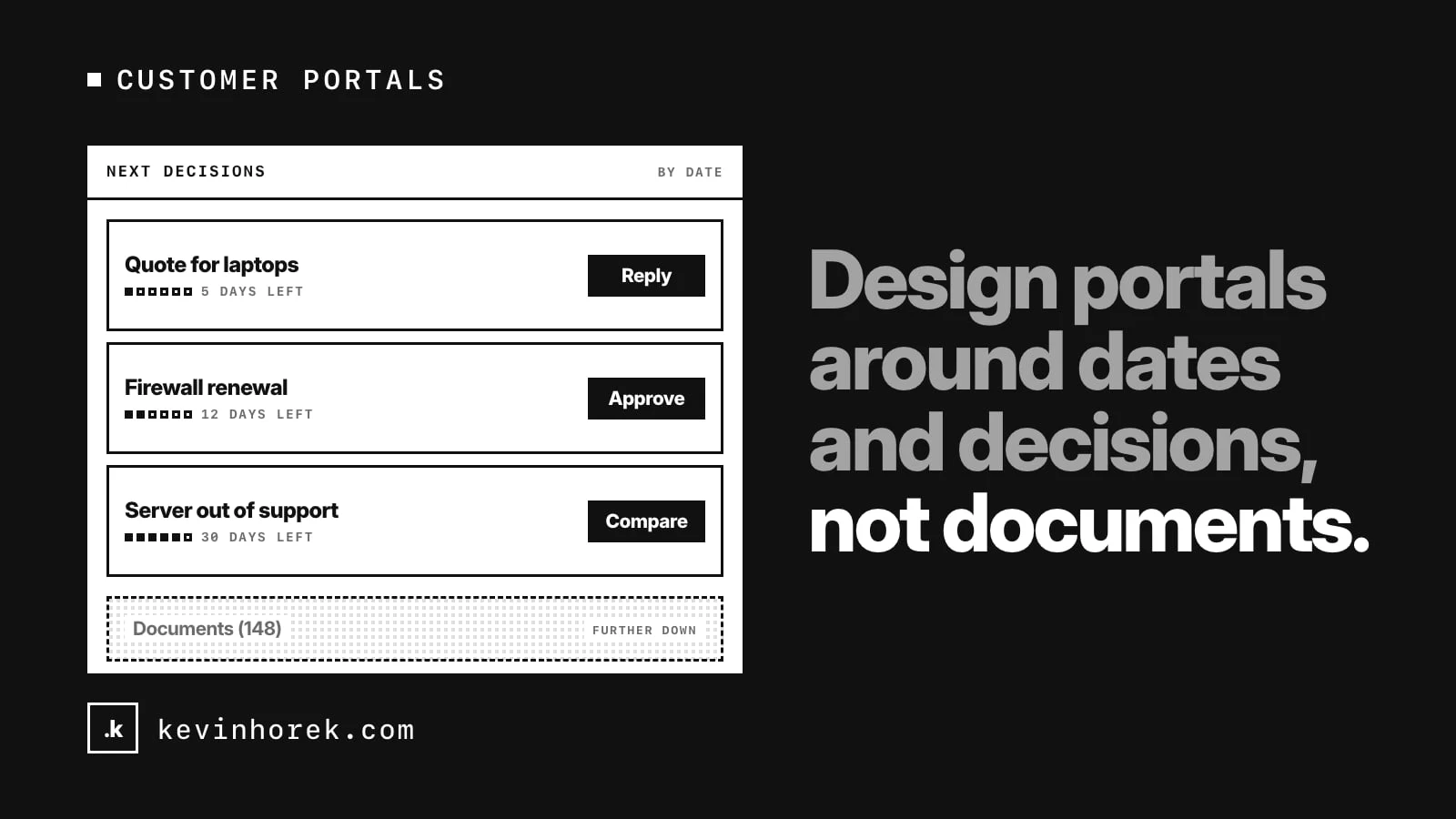
My advice for anyone designing a customer portal: build it around dates and decisions, not documents.
A portal full of documents is a filing cabinet
Many customer portals start as a place to download things. Invoices, contracts, quotes, reports. That is useful, but it puts all the work on the customer. They have to open each file, find the date that matters, and remember it.
Customers do not log in to read documents. They log in because something needs a decision. Should we renew this? Should we replace it instead? Which of these quotes do we accept? Is this fix worth paying for?
So the first question for a portal is not "what files do we have?" It is "what does this customer need to decide, and by when?"
Put the next decision on the first screen
The home screen should show what needs the customer's attention, in date order, with a button that does the next step.
- A renewal due soon: review it or approve it.
- A quote waiting for a reply: open it and accept or ask a question.
- A device that is out of support: compare replacements.
- A problem found in a health check: see the fix and approve the work.
Each item should take the customer straight to the place where they can act. A list that says "you have three items" and then sends people hunting through menus is only half the job.
I would keep this list short. If everything is urgent, nothing is. Sort by the date a decision is needed, and let the rest sit one click away.
Show time, not just dates
A date on its own is easy to miss. "Expires 14 March" means little until you work out how far away that is.
Show the time left as well as the date. Group renewals into what is already expired, what is due in the next few weeks and what is coming later in the year. A simple timeline or calendar view helps people see busy months before they arrive, which matters when a few renewals land at once and someone has to find the budget.
Show the cost over time too. A customer planning next quarter wants to know what is coming due over the next 90 days and the next 12 months. That turns a pile of separate renewals into a plan.
Make the decision possible in the portal
If the portal shows a renewal but the customer has to email someone to approve it, you have built a reminder, not a tool.
Let customers do the common actions where they see them:
- approve one renewal, or several at once, with a purchase order number if they use one;
- ask for a quote when none has been drafted yet;
- snooze a reminder for a set time, so it comes back instead of disappearing;
- decide not to renew something, and record why.
Each action should leave a record both sides can see. The customer knows what they approved. The seller knows what was decided and does not have to chase. I wrote about this kind of record in turning messy documents into decisions people trust: a value is more useful when you can see who approved it and when.
Not every renewal should be renewed
A good portal helps customers make the right call, not just the fast one.
Some things should be replaced instead of renewed. Hardware that has reached the end of its life is the obvious case. Renewing its support may cost money and still leave the customer exposed. The portal should flag those items and offer a different path: compare replacements, plan the retirement, and stop counting the old support in future spend.
This is where a seller earns trust. Recommending against a renewal costs a little revenue today. It shows the customer the portal is on their side.
Turn findings into scheduled work
Many sellers send a regular report: a health check, an audit, a review. The findings sit in a PDF and often go no further.
Treat each finding as a decision too. Let the customer pick which fixes to do, add them to a plan and send it as a request. When the work is done, show the result. If the next check shows the score improving, the customer can see the value of the work they approved.
Customers do not need more documents. They need to see what is due, decide, and know the decision was recorded.
Get the data in
None of this works if the dates are wrong or missing. Most sellers already have the data somewhere: order history, spreadsheets, vendor accounts. Start with an import from the files you have, check the rows that fail, and fix them before building any live connection. Bad dates in a renewal tool are worse than no tool, because people trust them.
Try it
I built a rough prototype of this idea, RenewalDesk, a portal an IT reseller could give its business customers. The dashboard leads with a "Needs your attention" list. Renewals have timeline, list and calendar views, you can approve several at once or snooze a reminder, and end-of-life hardware gets a "compare replacements" path instead of a renewal. Try the demo. It runs on made-up data, and nothing is sent.
A checklist for renewal-driven portals
- List the decisions customers need to make, and by when.
- Put the next decisions on the first screen, sorted by date, each with a button.
- Show time left and spend coming due, not just dates.
- Let customers approve, ask for a quote or snooze in the portal.
- Flag items that should be replaced rather than renewed.
- Turn report findings into work customers can approve.
- Import the data you already have, and fix bad dates first.
How do your customers find out about renewals today? A portal, an email, a phone call, or the day something stops working?
If you have a renewal story, good or bad, email me.
#UX #CustomerExperience #B2B #Workflow