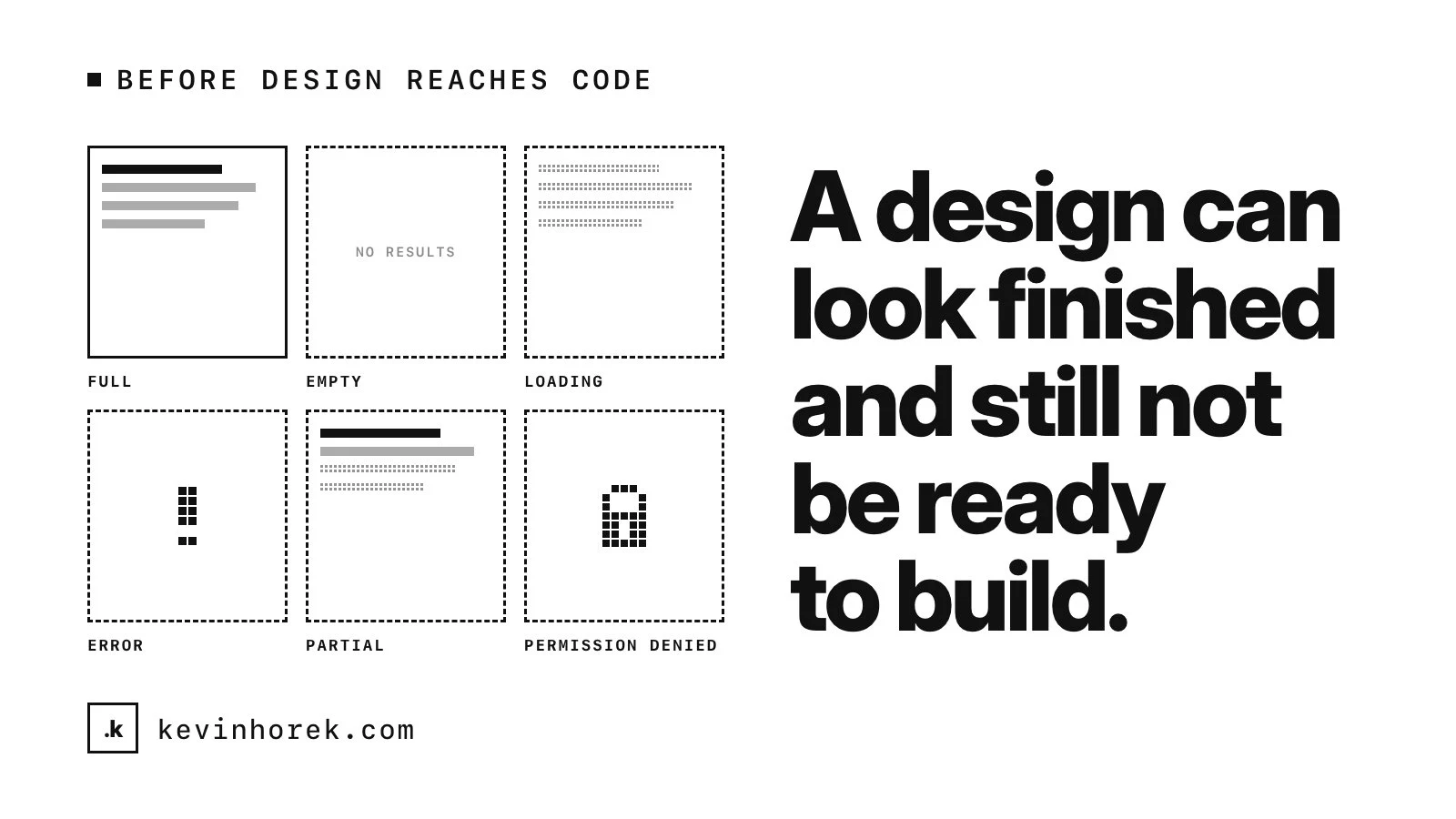
A design can look finished and still not be ready to build. Not because a developer can't make it, but because it answers one question, what this looks like when everything goes right, and leaves the rest to whoever writes the code.
Those questions don't go away. They get answered in code, by whoever gets there first, usually under deadline and without the designer in the room.
I have spent more than 30 years in technical UX, working between design and front-end code. Before a design reaches code, I run the same checks. None takes long, and each is cheaper to settle in a design file than in a pull request.
Why AI design tools raise the stakes
AI design tools generate polished screens in seconds. That is useful, and it changes the risk. A generated screen usually shows the happy path: a tidy table, a full profile, a chart with good-looking data. It looks finished, so people skip the questions they would have asked of a rough sketch.
More screens also reach developers, faster, each with the same gaps. And a generated screen can quietly invent a new dropdown or card instead of using the one you have. I wrote about why AI design tools need product context. These checks are one way to supply it.
Every state, not just the full one
For every screen and every component that loads data, I ask to see:
- Empty. First use, a search with no results and a list someone has cleared are three different empty states with three different messages.
- Loading. First load, a refresh and a slow connection. Does the layout jump when data arrives?
- Error. A field error, a failed save and a page that couldn't load. What can the person do next?
- Partial. Some data loaded and some didn't, a profile half filled in, a list still paging.
- Permission denied. What someone sees when they reach a screen or record they can't use.
Messages need designing too. WCAG's status messages criterion covers result counts, errors and busy indicators, which have to reach screen reader users without taking focus. If the design doesn't say what the message is, nobody can build it.
Real data, at real length and volume
Design files are full of short names and round numbers. Real data isn't. I check:
- The longest and shortest realistic name, title, email address and amount. Where does text wrap or truncate, and how does someone see the full value?
- Zero items, one, a typical number and far more than typical. A table designed with eight rows tells you nothing about the day it has 800. Does it page, filter or scroll?
- Dropdowns with hundreds of options, charts with a single data point, and dates in the formats your users actually use.
Work queues and analytics screens, like the ones I have been prototyping for a dental revenue-cycle platform, are where this matters most, because their job is handling volume.
Every screen size
I wrote a book on responsive design, and the problem hasn't gone away. I ask what happens between the drawn breakpoints, not only at them. Tables on a phone, hover-only actions on touch screens and sticky headers that cover content all need an answer.
WCAG 2.2 gives two useful tests. Content should reflow at 320 CSS pixels wide without scrolling in two directions, and text should resize to 200 percent without losing content or function.
Who is looking
Most products have more than one kind of user. For each screen I want to know which roles can see it, what each can do, and whether controls a role can't use are hidden or shown disabled with a reason. I also ask what happens when someone's role changes while the screen is open. These answers shape the data model and the API, not just the screen, so they need to exist before the code does.
Accessibility basics
I don't do a full audit at this stage. I check what a design file can show:
- Contrast. WCAG 2.2 asks for 4.5:1 for normal text, 3:1 for large text, and 3:1 for what people need to see to identify controls and their states, like input borders and focus indicators.
- Focus order. Focus should move in an order that preserves meaning, and stay visible rather than hidden under a sticky header or footer.
- Labels. Every field gets a visible label, not just placeholder text.
- Target size. Pointer targets of at least 24 by 24 CSS pixels, with a few exceptions.
The rest has to be checked in code, which is why AI-generated UI still needs an accessibility review.
The interactions nobody drew
A static screen implies dozens of behaviours. I list them and ask about each. What happens when you click a row? Can you sort, filter or select several at once? What is in the three-dot menu? Is there an undo, or a confirmation before something destructive? What happens to unsaved changes if someone navigates away? If something can be dragged, how does a keyboard user do the same thing?
Existing components or new ones
Finally, I go through the design element by element and mark each one as an existing component, a variant of one, or something new. New is fine when it is deliberate. A near-copy of an existing component is the worst outcome: it looks the same, behaves slightly differently, and doubles the maintenance and the accessibility testing. If the new version is better, the real question is whether it should replace the old one everywhere.
What comes out of it
The result is not a redesign. It is a short list of questions for the designer and decisions for the product owner, settled before anyone estimates or builds. A design that answers them is one a developer, or a coding agent, can build without guessing.
If you have a design about to go to development and want someone to run these checks with you, email me.