AI tools can now produce a polished screen in seconds. The spacing is right, the colors are on brand, the buttons look like buttons. Open it in a browser and it looks finished.
I would not call an interface finished because it looks right in a browser. I have been building for the web for more than 30 years, and "responsive and accessible by default" is part of every engagement I take on. AI has made the first draft of an interface much faster. It has not made the review optional.
What the research says
A W3C talk by Dominique Hazaël-Massieux on web standards and AI-driven development, from WebEvolve 2026, pulls together recent research on AI-generated code and accessibility. The picture is uneven.
One study it cites found that language models handle basic accessibility requirements well but struggle with more complex ones, particularly ARIA attributes, and there did worse than human developers. The same study found that advanced prompting techniques produced code with fewer accessibility issues than human-written code, while still pointing to inherent limits in fixing accessibility through prompting alone. Another source cited in the talk went further, concluding that error counts were too high to rely on the technology for accessibility work at all, even with explicit expert guidance.
I read that as: AI can get you a long way on the basics, better prompts help, and none of it replaces checking.
A screenshot is not an accessibility test
A screenshot shows pixels. It does not show what a screen reader announces, where focus goes when you press Tab, whether an error message is ever read out, or what happens when someone zooms the page to 200%.
That is why visual review, however careful, is not enough. Many accessibility problems are invisible in a screenshot and obvious the moment you put the mouse away.
Keyboard and focus
This is where I start, because it is quick and it finds a lot.
- Can you reach every interactive element with Tab, in an order that matches what you see?
- Is focus always visible, including on custom buttons and links?
- Does a dialog move focus into itself, keep it there and return it when it closes? Does Escape close it?
- Do custom menus, tabs, comboboxes and date pickers respond to the keys people expect?
Custom widgets are where the complex ARIA lives, and the research above suggests that is exactly where generated code is weakest. A native button or select element gets most of this right for free. A div styled to look like one gets none of it unless someone builds it in.
Labels, instructions and error recovery
Generated forms often look clean because they leave things out. Placeholder text stands in for labels. Errors appear in red with no text. Instructions show up only after the first mistake.
What I check:
- Every field has a visible label that is tied to it in the code, not just placed near it.
- Instructions and format requirements come before the field, not after a failed submit.
- Error messages say what is wrong and how to fix it, are announced to screen readers, and sit next to the field they refer to.
- Nothing the person typed is thrown away when an error appears.
Error recovery is where accessibility and plain usability overlap almost completely. A form that a screen reader user can recover from is usually a form everyone can recover from.
Reuse components instead of regenerating them
One quiet risk of AI-built interfaces is variety. Ask for a new screen and you may get a slightly different dropdown, modal or tab set each time, each with its own accessibility bugs.
I would rather build a small set of accessible components once, test them properly and have every screen reuse them. Then a fix in one place is a fix everywhere, and review time goes to the flows instead of the hundredth custom dropdown. If you build with coding agents, put that in the written rules they work under: use the existing components, and do not invent new patterns without a reason.
Automated checks, and what they miss
Automated accessibility checkers are worth running on every preview. They catch missing alt text, low contrast, missing labels and some ARIA misuse, and they catch them consistently. BlastRocket, for example, has an accessibility suite alongside its unit, API and visual suites.
But a checker cannot tell you whether alt text is meaningful, whether the focus order makes sense, whether an error message actually helps, or whether someone using a screen reader can complete the task. Those need a person.
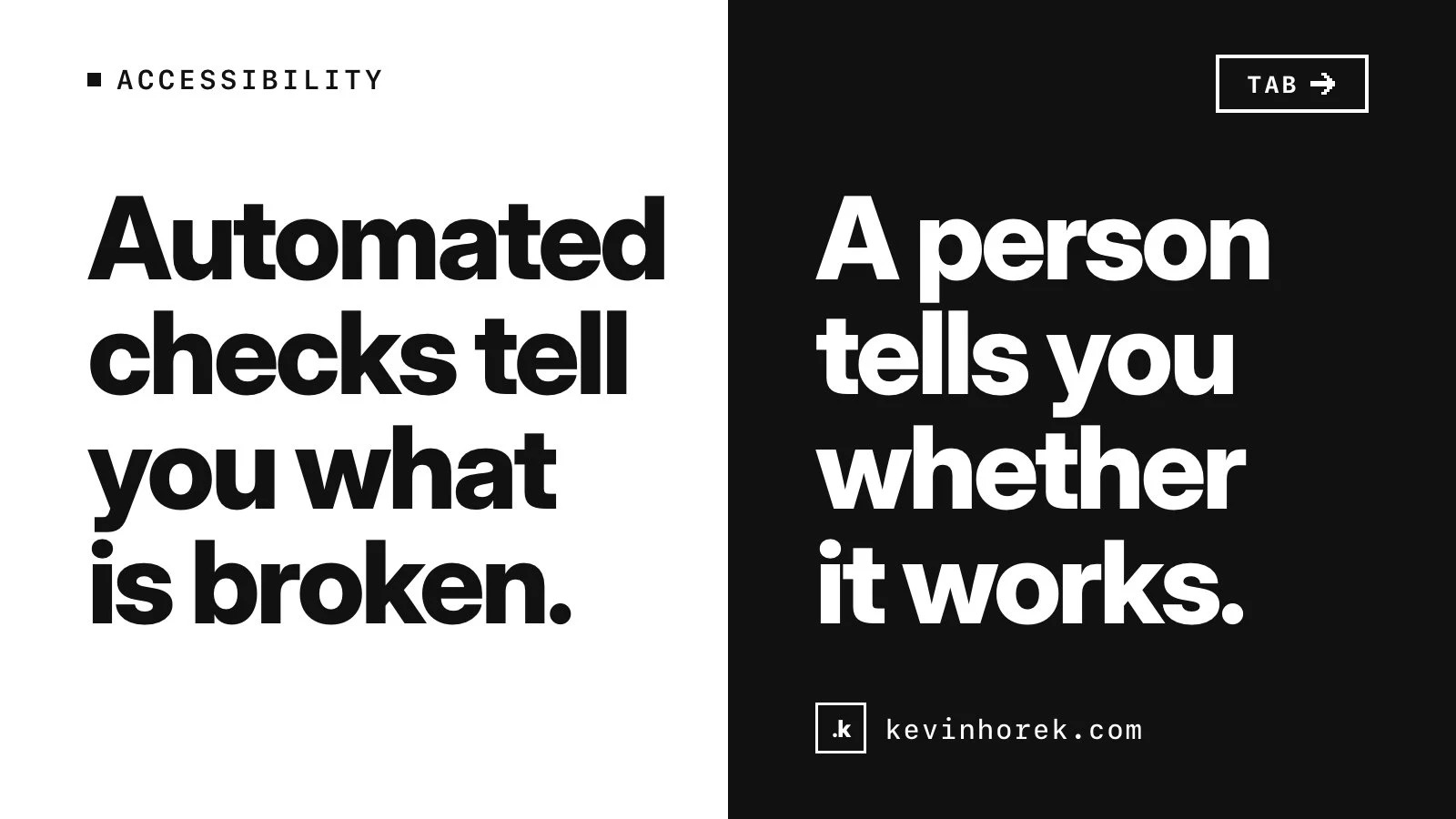
Automated checks tell you what is broken. A person tells you whether it works.
What I check before calling a screen done
- Run an automated checker on every preview and fix what it finds.
- Complete the core flow with the keyboard only.
- Complete it again with a screen reader, listening to what is announced.
- Zoom to 200% and check every screen size you support.
- Submit every form with wrong and missing input, and try to recover.
- Check that new screens reuse existing components instead of adding one-offs.
- Put it in front of real users, including people who rely on assistive technology when you can.
That last step matters as much as the others. It is the same reason I test every preview with real users: what people do beats what anyone predicts.
If you have an AI-built interface and want a second pair of eyes on it, email kevin@kevinhorek.com with "Teardown" in the subject for a free 10-minute teardown.