Most dashboards are built by adding things. A chart for this, a count for that, a table someone asked for in a meeting. Each one makes sense on its own. Together they make a screen people glance at and close.
The problem is not too much data. It is that nobody decided what the screen is for.
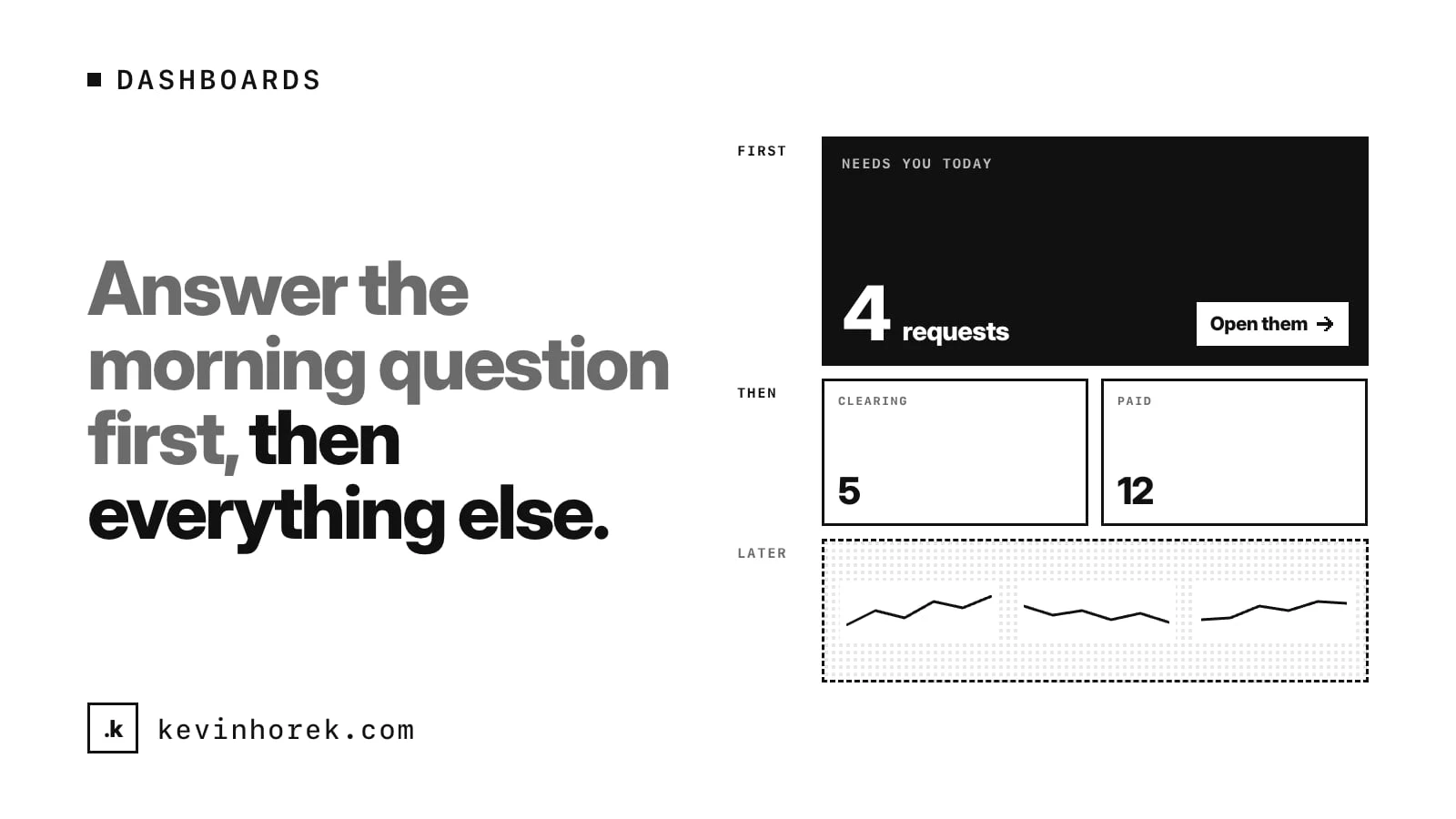
My advice: before you design a dashboard, write down the one question the person opening it needs answered first. Then design the screen around that question.
Find the morning question
Think about the moment someone opens the screen. Usually it is the start of the day, or the start of a shift. They have a few seconds of attention before something else takes it.
What do they need to know in those seconds? Not everything they might want to know eventually. The one thing that decides what they do next.
For a small landlord, it might be: who hasn't paid rent this month? For a support lead: what is about to breach its deadline? For a branch manager: what needs my sign-off today? For a founder: how much runway do we have, and did it change?
Each of these is a question with an answer that leads to an action. That is what makes it a good first question.
Ask the people who open it
You will not find the morning question by looking at the data. You find it by watching people start their day.
Ask them what they check first, and where. Often the answer is not your product at all. It is a spreadsheet, a bank app, a text thread, or a sticky note. That side system is telling you what the dashboard should have shown. I wrote about how I run those sessions in discovery calls and walk-throughs.
If different roles have different morning questions, that is fine. It may mean they need different starting screens, or that each role sees its own question at the top.
Put the answer and the next step at the top
Once you know the question, put the answer in the top left of the screen, where the eye lands first. Make it big enough to read at a glance.
Then put the next step right beside it. If the answer is "four tenants still owe rent," show the four names, each one a click away from their details and a way to follow up. A number alone makes people go looking. A number with the list behind it lets them act.
Two rules help here:
- Every number should open the list it counts. If a card says seven open requests, clicking it should show those seven.
- Show the state, not just the total. Paid, clearing and overdue are three different situations. Lumping them together hides the one that needs attention.
Then answer the second and third questions
Once the first question is answered, there is room for more. But keep the order deliberate.
The second question is usually about what is coming: leases ending soon, deadlines this week, renewals next month. The third is about trends: is this getting better or worse over the last few months?
Put them below the first answer, in that order. Things that need action now go above things that need action soon. Things that need action soon go above things that are only interesting.
Recent activity, charts of long-term trends and summary numbers nobody acts on can go at the bottom, or on their own page.
Cut what nobody uses
Every dashboard collects cards nobody reads. Someone asked for it once. It was easy to add. Now it takes space from something that matters.
Every few months, look at each part of the screen and ask: did anyone act on this? If you have usage data, use it. If not, ask the team. Remove what nobody uses, or move it off the main screen. A dashboard should get shorter as you learn, not longer.
Make it work on a phone
The morning question often gets asked before anyone reaches a desk. A landlord checks rent from the kitchen. A manager checks approvals on the way in.
On a small screen, the order you chose matters even more. The first answer should be the first thing on the phone, with the next step one tap away. Everything else can stack below it. If your dashboard only makes sense on a wide monitor, it will not get opened in the moment that matters most.
Keep the numbers honest
A dashboard is only useful if people trust it. If a count is out of date, say when it was last updated. If an item is clearing but not confirmed, show it as clearing, not paid. If a number is an estimate, label it.
People forgive a dashboard that says "we don't know yet." They stop opening one that was wrong once without saying so.
Decide what the screen is for. Answer that first, show the next step beside it, and let everything else wait its turn.
This is the same thinking behind designing work queues teams actually clear: the most useful screen is the one that tells people what to do next.
Try it
I built a rough prototype of this idea, Rentr, for small landlords with a handful of buildings. The dashboard opens on this month's rent, split into paid, clearing and overdue, with a still-to-pay list of the tenants who owe. Maintenance and leases ending in the next 60 days come next, and longer trends sit lower down. Try the demo. It runs on made-up tenants and buildings, and messages are simulated.
A checklist for a dashboard people open
- Write down the one question the person opening it needs answered first.
- Watch people start their day to find it, including what they check outside your product.
- Put the answer at the top, with the next step beside it.
- Make every number open the list it counts, and show states, not just totals.
- Order the rest: now, then soon, then trends.
- Cut or move cards nobody acts on.
- Make the first answer the first thing on a phone.
What is the first thing you check when you open your main dashboard in the morning? Is it at the top of the screen?
If your dashboard has grown into a wall of cards, email me and tell me what you wish it answered first.
#UX #Dashboards #ProductDesign