A lot of operations software comes down to one screen: a list of things someone has to handle. Claims to follow up. Applications to review. Tickets to answer. Approvals waiting on a decision.
That list is where the team spends its day. Designed well, people open it, work through it and go home knowing what is left. Designed badly, the list only grows, the oldest items sit untouched at the bottom, and someone keeps a spreadsheet on the side to track what the software should have.
Part of my ongoing client work is product and design work for a dental revenue-cycle platform, including work-queue prototypes. After 30+ years in technical UX and product, these are the rules I keep coming back to when I design a queue.
Start with one definition of done
Every queue needs a plain answer to one question: when does an item leave?
"Reviewed" is not an answer. Reviewed and approved? Reviewed and sent back? Reviewed and waiting on someone outside the team? If three people would answer differently, the queue will never shrink, because an item that is finished to one person is still open to another.
Write the exit conditions down. There are usually only a few: resolved, handed to another team, closed with a reason. Everything else is still in the queue, whatever its status label says.
Agree on priority, then show it
Most teams have an order they work in, even if nobody has written it down. Oldest first. Highest value first. Closest deadline first. Often it is a mix.
The trouble starts when that order lives in people's heads. One person works oldest first, another picks the quick ones, a third sorts by value. Nobody is wrong, but the queue behaves randomly.
So agree on the rule with the team, then make it visible. Show the age, value or deadline on every row, and sort by the agreed rule by default. If priority is a score, show what went into it. A number nobody can explain gets ignored.
Make ownership obvious
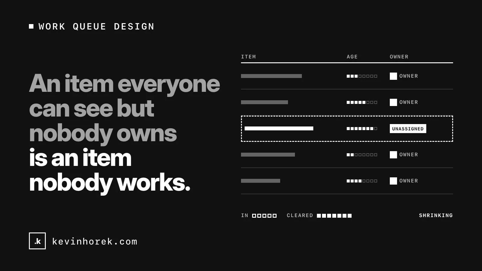
An item everyone can see but nobody owns is an item nobody works.
Each item should show who has it, or show clearly that nobody does yet. Decide how work gets assigned: people pull the next item, a lead assigns, or rules route by type. Then design for the moments around it:
- What happens when an owner is away?
- Can someone take an item from a colleague, and is that recorded?
- What does unassigned work look like, and who watches for it?
I would make "mine" and "unassigned" two of the first views anyone sees.
Record a reason when items move or stall
When an item changes status, moves to another team or sits waiting, ask for a reason. Keep it short: a pick list for the common reasons and a note field for the rest.
Reasons do three jobs. The next person to open the item knows what happened without asking. A lead can see why things are stuck. And over time, the reasons show where the process breaks, which is some of the most useful product research you can get. I do the same in my own products: applicant tracking records a reason at every step.
Make the reason quick to give. If recording it takes longer than the work, people will pick the first option every time.
Batch the common case, give the exception full detail
Most items in a queue are routine. A smaller number are not.
Design for both. For routine items, let people select many and act once: assign, approve, or close with the same reason. For the exception, give a full detail view with the history, the documents, the reasons recorded so far and everything someone needs to make a judgment call, without opening four other tools.
It is easy to design only one of these. A queue with only detail views makes routine work slow. A queue with only bulk actions pushes hard cases through without anyone looking. Bulk actions should also show exactly what they will change before they run, and be easy to undo where the action allows it.
Show whether the queue is shrinking
A total count tells you very little on its own. Two hundred items could be a good day or a bad one.
What helps a team is the trend:
- items in and items cleared, per day or week;
- how many items are past an age the team cares about;
- the oldest item, and how old it is;
- where items are waiting, and on whom.
Put these where the team sees them every day, not in a monthly report. A team that can see the queue going down knows its work is landing. A team that can see it growing can raise it before it turns into a backlog.
Don't hide work in filters
Filters are useful. They are also the easiest place to lose work.
A default view that leaves out some statuses, a saved filter someone forgot they set, a "snoozed" state with no end date: each one makes the queue look smaller than it is. The items in those states still have someone waiting on them.
A few rules help:
- Always show the total, and how many items the current filter is hiding.
- Keep "everything" one click away.
- Give every waiting or snoozed state a date it comes back.
- Never let an item disappear without a recorded reason.
A queue is only clear when the team can see everything in it, in the order they agreed, with someone owning each item.
Watch the team work the queue
None of this comes from a feature list. It comes from sitting with the people who work the queue and watching them do it. The side spreadsheet, the item they always skip, the note they write on paper because the system has nowhere for it: those are the requirements. I wrote about how I run those sessions in discovery calls and walk-throughs.
A checklist for queue design
- Write down what done means, and the few ways an item can leave.
- Agree on the priority rule, show it on every row and sort by it.
- Show who owns each item, and make unassigned work visible.
- Ask for a short reason when items move or stall.
- Batch the routine work, and give exceptions a full detail view.
- Show the trend: in, out, ageing and the oldest item.
- Show what filters hide, and never let work disappear.
If your team's queue only ever grows, email me. I am happy to look at it with you.