When a family waits months between specialist appointments, every new photo or scan becomes a question. Has it changed? Is it worse? Should we call someone?
That is the space I am building Together Through for. It is a family health workspace that starts with scoliosis: repeat back scans compared over time, a care journey, appointment preparation, and support plans for school and everyday life.
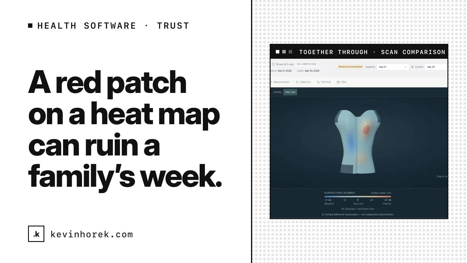
It is also a space where good intentions can do harm. A bright red patch on a heat map can ruin a family's week, even when the "change" is just a different posture or camera angle.
Here are the design rules I landed on, and how to apply them to any product that shows people sensitive data about someone they love.
Lead with whether the comparison can be trusted
The first instinct with comparison data is to show the difference. Baseline on the left, current on the right, a color scale for what moved.
The problem is that a difference between two scans can come from posture, camera position or coverage, not only from the body. If you show the raw difference first, you are asking a worried parent to do the error analysis in their head.
So in Together Through, every comparison leads with scan quality and comparability. Before anyone sees what changed, they see a plain status:
- Comparable: the two scans can be compared with reasonable confidence.
- Not comparable: something about the capture makes the comparison unreliable.
- Retake recommended: a new scan would give a better answer than this one.
Only then does the heat map appear, and it always carries a numeric scale and a legend.
The trade-off is real. You get fewer dramatic visuals. But families and clinicians can trust the ones they do see, and that trust is the whole product.
What to take from this: if your product compares anything over time, decide how you will show confidence before you design how you will show change. Uncertainty is part of the answer, not a footnote.
Never hand out verdicts you are not qualified to give
There is no "better" or "worse" label anywhere in the comparison. That was a deliberate decision, not an oversight.
A surface comparison is a visualization. It is not a diagnosis, and the product says so on the screen itself. Interpreting what a change means belongs to the care team.
This is harder than it sounds, because verdicts feel helpful. But a confident label that turns out to be wrong does more damage than an honest "here is what we can see, and how sure we are."
The same rule shapes the rest of the product. The care journey puts scans, appointments, brace and physio notes on one timeline, recorded as context with no inference of cause or effect. Places carry labels like family experience, needs confirmation or bring your own, never a universal "safe" badge.
Separate what clinicians need from what families need
Clinicians need technical detail. Families need calm, bounded explanations. Putting both in one view usually means nobody gets what they need.
Together Through has separate modes. The care team reviews first, and nothing reaches the family summary until it has been reviewed and explicitly approved. Private notes and photos stay out of what gets shared.
That adds a step for the care team. In exchange, there are no alarming surprises at home.
What to take from this: when your users have very different levels of expertise, design the handoff between them as a feature. An approval step is not friction if it protects someone.
Treat privacy as architecture, not a settings page
Health information about children needs more care than a typical app. Early on I had to choose between uploading files to a server from day one or keeping the prototype in the browser.
The prototype runs entirely in the browser. X-ray photos are held in memory, never uploaded or exported, and every subject is de-identified demo data.
Nothing persists between sessions yet, which is a real limitation. But it lets me test the experience before any real record exists, and it puts the privacy and security architecture first instead of retrofitting it.
If you are early in a sensitive product, ask: what is the smallest amount of data I need to hold to learn what I need right now? Often it is less than you think.
Put AI inside the same limits
AI is planned for Together Through, within firm limits. It may summarize reviewed data, prepare appointment questions, explain trends in plain language and coach people toward better scan quality.
It will not diagnose, prescribe, change a brace, or replace an X-ray or a specialist.
Writing those limits down first matters. It is far easier to design an AI feature that stays in bounds than to pull back one that already gives advice.
Families and clinicians should be able to trust every visual they see, even if that means showing fewer of them.
What this adds up to
None of these rules is complicated on its own:
- Show how far a comparison can be trusted before showing what changed.
- Do not give verdicts that belong to a professional.
- Design separate views for experts and the people they care for.
- Hold as little sensitive data as you can while you learn.
- Decide where AI stops before you build where it starts.
Together, they separate a product that adds to a family's worry from one that helps them feel prepared. The next step for Together Through is a design-partner pilot with a scoliosis-informed physiotherapy clinic and a brace provider.
If you are building software that touches health, family or anything personal, and you want a second set of eyes on where trust could break, email me. I am always happy to talk it through.