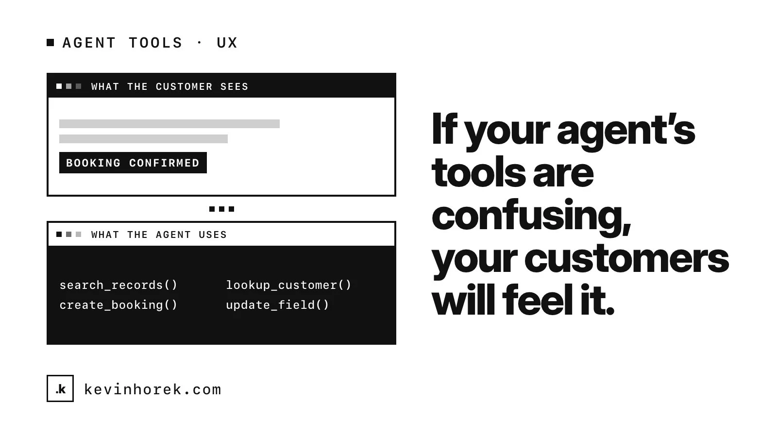
When people talk about the user experience of an AI product, they usually mean the chat window, the screens and the wording of the answers. That is the part customers see.
Behind it, an agent is using tools: functions that search records, look up a customer, create a booking, update a field. Each of those tools has its own interface, designed for the agent rather than for a person. The quality of that interface shows up, one step later, in what the customer experiences.
The interface your customer sees depends partly on the interfaces your agent uses.
Tools are an interface, so design them like one
Anthropic's guide to writing effective tools for agents describes tools as a contract between deterministic systems and non-deterministic agents. Its earlier guide on building effective agents suggests putting as much effort into the agent-computer interface as teams put into human-computer interfaces.
After 30 years of designing interfaces for people, I find that framing useful, because most of the same principles carry over. Clear labels. One job per control. Feedback that tells you what happened. Errors that help you recover.
Clear names, narrow jobs
The tools guide makes a point that will be familiar to anyone who has cleaned up a cluttered menu: more tools do not always lead to better outcomes. Each tool should have a clear, distinct purpose, because overlapping or vague tools leave agents unsure which one to use.
It also suggests shaping tools around tasks rather than wrapping every API endpoint. Instead of separate tools to list users, list events and create an event, a single tool that schedules an event can find availability and book it. And it recommends grouping related tools under shared prefixes, by service or by resource, so the agent can tell them apart.
That is the same discipline as designing a screen around what the person is trying to do rather than around your database tables.
Return what is useful, not everything
Agents have limited context, so the guide advises returning only high-signal information: meaningful fields such as names rather than every technical detail, and an option to control how detailed a response is. For large results it recommends pagination, filtering or truncation, with helpful instructions when a response is cut short. For Claude Code, it notes, tool responses are limited to 25,000 tokens by default.
For the customer, an oversized response is not a technical detail. It makes the agent slower, more expensive to run and more likely to miss the one fact that mattered. A tool that returns a clear answer to the question asked produces a better answer for the person waiting on it.
Errors that help recovery
Good form validation tells a person what went wrong and how to fix it. The guide asks the same of tool errors: point to specific, actionable improvements instead of opaque error codes or tracebacks, and show an example of correctly formatted input where that helps.
An agent that gets a stack trace back has little to work with, so it guesses or tries again blindly. An agent that is told the date must be in a particular format, and what it sent instead, can usually fix the call and carry on. The customer just sees that it worked.
Ambiguous inputs and missing details
The guide recommends describing expected inputs and outputs clearly and enforcing them with strict data models, and writing tool descriptions the way you would explain the tool to a new hire. It also notes that small refinements to tool descriptions can produce large improvements. The agents guide has a name for designing arguments so mistakes are harder to make: poka-yoke.
Sometimes the right response to missing information is not a better guess. It is to ask the person. In Mentor Intelligence, the in-app assistant acts as the signed-in staff member, and only after they confirm the steps it has listed. That confirmation is part of the tool design, and it is also part of the experience: the person sees what is about to happen before it happens.
If your agent's tools are confusing, your customers will feel it, even if they never see them.
Test tools the way you test screens
The tools guide recommends standing up a quick prototype of your tools, trying them yourself, then evaluating them on realistic tasks, which can take many tool calls. Beyond whether the task succeeded, it suggests tracking the runtime of tool calls, how many calls were made, token consumption and tool errors.
Those are the agent's version of usability metrics. A lot of calls for a simple task often means a tool is missing or badly shaped. Repeated errors on one tool often mean its description or its inputs are unclear. Reading the transcripts tells you why, the same way watching a person use a prototype does.
I treat this the same way I treat testing every preview with real users. You do not find out whether an interface works by reading it. You find out by watching someone, or something, try to use it.
A short tool review
- Does each tool have one clear job, and a name that says what it is?
- Are tools shaped around the tasks people actually do?
- Does each response return what the agent needs, and no more?
- Do errors say what went wrong and how to fix it?
- Are inputs clearly described and enforced?
- Does the agent ask a person when it is missing something important?
- Have you tested the tools on realistic tasks and read the transcripts?
If you are building an agent and want someone to look at its tools with a UX eye, email me at kevin@kevinhorek.com.